Tech-Grid

I work as a consultant on projects that are going through their prototyping/early-development phases. Part of this process is to choose an architecture that will solve the clients current problems, but is flexible enough to accommodate scope changes in the future. Building out the architecture involves choosing technology to fulfil facets of the architecture, but this in turn shapes the architecture as no technology will fit perfectly and certain technologies will approximately solve multiple needs.
The result is a rapidly changing tech-stack. This is confusing and leads to the situation where nobody is across what the vision is for the architecture anymore, and since that’s the case, they will add to the chaos by choosing technology that has merit, but would be better off being replaced by an existing piece of the stack that would suit the task. Or conversely if their choice is superior, maybe the currently technology in the stack should be replaced.
You need visibility of your entire tech-stack. This is the only way that you can combat these issues. The simplest way is to just keep a list of every piece of technology you are using. But then there are categories of tech, services, your own services, languages, data-types/schemas, etc, etc. As well as the multitude of items that rapidly appear, there’s also the problem of tracking how these pieces interact, and when they can be removed from your list.
This is where the idea of the Tech-Grid comes from.
It gives you a way to see:
- Your Stack at a glance
- Your Stack Debt
- What may be removed from the stack
- Groupings and Categories
- Interactions
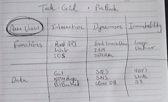
The Tech-Grid is a multidimensional view of your stack. It allows you to view the stack through pairs of axes to see how the technology fits together and can be decomposed.

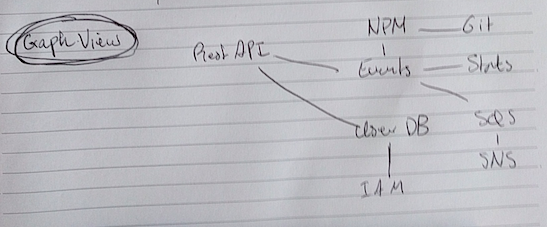
It is also a graph. The services being the edges, and the interactions between the services being the edges.

It is a hyper-document, with links to other information, such as service documentation, project pages, wikis, clarification, bug-trackers… Annotations and layers provide a way to show dimensions other than the two chosen for positional layout, as well as contextual information about the service nodes. Context can be represented by attributes which manifest as links, coloring, shapes, etc.

This was a brain-dump of an idea I’ve been trailing and I’d like to build a small app to demonstrate this soon.
Stay tuned.