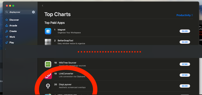
DispLayover - Side Project Ranked 20 on the App Store*
* In the paid productivity apps category… And I still don’t know exactly what this means…
Scratching your own itch for fun and profit!

Background - Limitations of Loom
Don’t get me wrong - I love Loom. It does several things very well:
- Instantly start a screencast with no setup
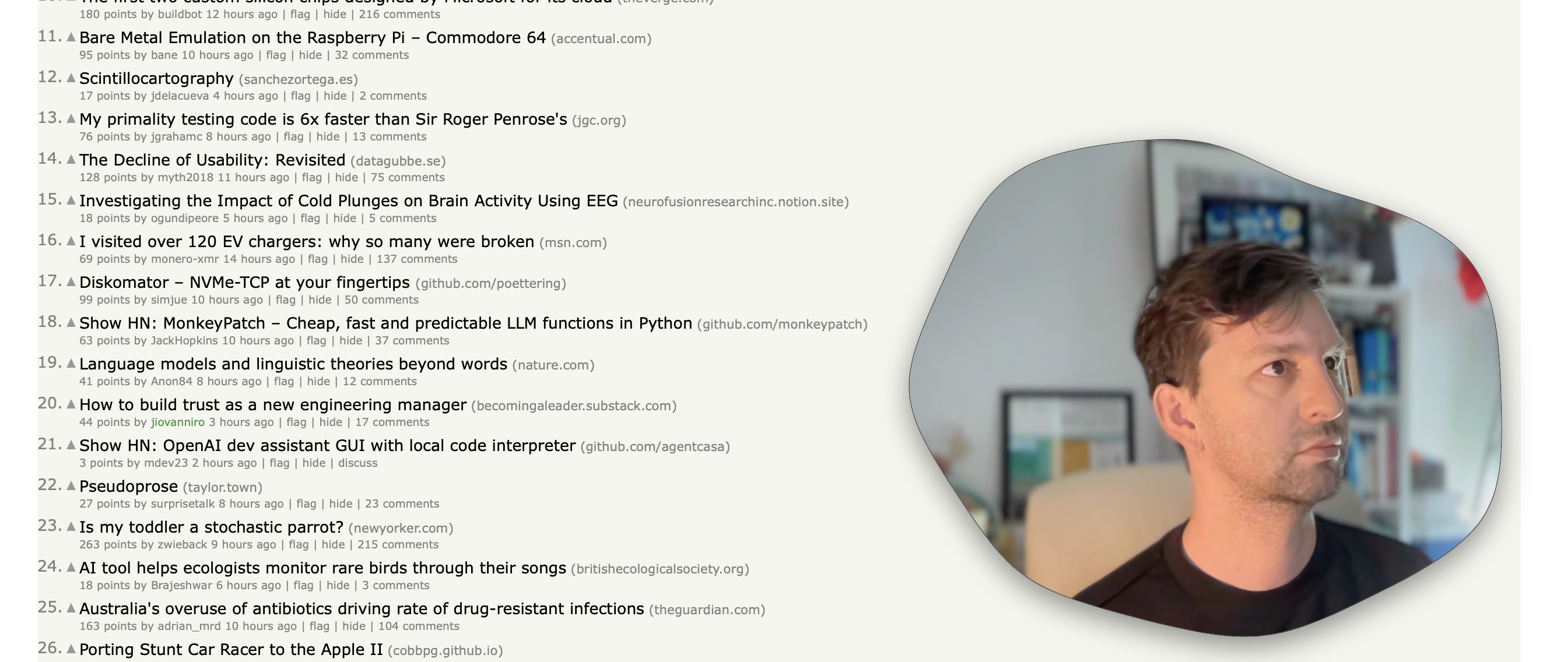
- A beautiful and unique circular camera overlay
- Automatically host and instantly share your recording after completion
- Make simple edits to the saved recording without having to use external software or perform exports and re-uploads
I had actually tried to pay for a subscription, however the organisation that owned the account wasn’t set up for individuals to do this. My long form videos were exhausted so all my videos were now 5 minutes maximum. I was approaching my 25 video limit, so I was probably going to have to archive my older videos once I hit that limit.
Even with these limitations adding up I was okay with the situation, that is, until I hit the final straw.
I was scheduled to present at a community event but since it was in another timezone I pre-recorded my presentation on Loom for the community manager to compile with other recordings into the final presentation. I’d done this in the past, but this time, I found that the “Download” option was no longer available and the work that I’d done on my presentation couldn’t be compiled. I’d have to re-record with another tool. This was very disheartening.
So with this wakeup call, I decided to evaluate what I liked about Loom and see what could be done in other ways:
Instantly start a screencast with no setup
This is possible with built in OS X tools with the COMMAND-5 shortcut.
A beautiful and unique circular camera overlay
You can use some other applications like photobooth, or quicktime to display a camera preview, although it is very janky looking.
Automatically host and instantly share your recording after completion
We already use Google Drive for hosting, so as long as it’s acceptable to drag and drop after recording then this is ok.
Make simple edits to the saved recording without having to use external software or perform exports and re-uploads
Quicktime can now instantly trim the recording after completion and export.
This means the two big missing pieces were:
- No instant sharing - I’d just put up with this and gain flexibility of hosting
- No circle camera preview - Call me shallow, but when that circle pops up in a thumbnail and when watching a screencast it elevates it to seem more unique and professional.
Could I replicate the circle preview somehow? If I could make a standalone app with this function then the unique presentation aesthetic would no longer be coupled to any particular recording software.
Can it be done?
I mean, obviously it can be done, but is it worth the time it would take?
I looked around for quite a while and trying many different documented techniques before finally stumbling onto this article which provided an overview of exactly what I was trying to achieve. I almost didn’t bother testing this since there wasn’t a “download project” link, but I was glad I did since it worked as a POC with almost no modifications.
You can see in the commit history on Github how the project evolved from this initial proof of concept to where it is now.
Since the feasibility was proven, now it was time for refinement.
Refinement
There were several things I wanted to get done before I would consider this project complete enough to share, but the top ones were:
- Eliminate all known glitches (there were many)
- Allow camera listing/switching
- Have fun new shapes
- Use standard permissions flows
Once these were done, if I was happy I’d share it via the RenSor Apple App Store account.
Of course the most fun to be had here was designing the overlay shapes!

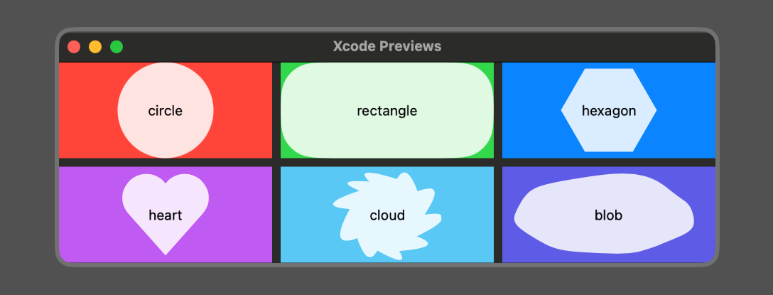
Outside of any ergonomics and convenience, the available overlay shapes are actually the core value proposition of the app. It might seem trivial, but seeing unique and fun shapes is what would attract anyone to use the app in the first place. Of course there will be new developments here in future, but the initial set of six included three “standard” shapes:
- Circle
- Rectangle
- Pill
and three “fun” shapes:
- Heart
- Cloud
- Blob
These were all very trivial except for the “blob” shape…

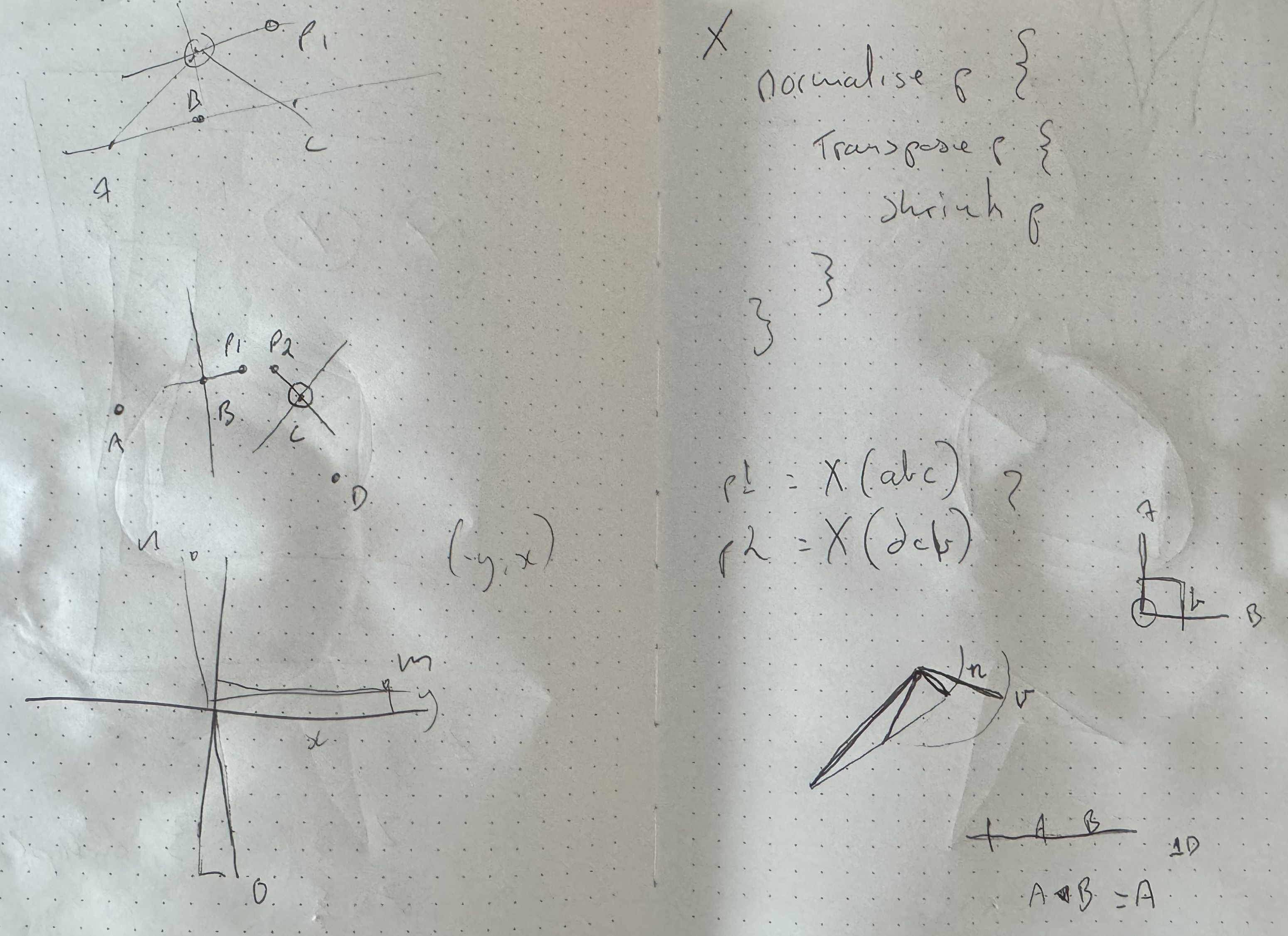
This was ironically where the most development time was spent. Ultimately it just uses splines, but having it feel right was quite tricky. Here’s the “BLOB Algorithm”:
Pre-Compute:
- For a number of sides N
- Calculate N equally spaced points on a unit circle
- Randomly shift the angle and radius of these points (with magic constants)
When rendering:
- Rescale the points according to the bounding rectangle
- For each side, calculate two spline control points that mirror their neighbouring side
- Scale the control point magnitudes according to the side’s length
- Draw the path
You can see the algorithm here!
This was a lot of fun, and generates really “Blobby Blobs” when using (roughly) 7-11 sides.
WTF
So with all of this done and tested I published to the App store… The next day I found that the app was ranked 20 in productivity apps. WTF!

This was… unexpected. I’m still not sure what if anything this means, but I’m now wishing I did more testing!
What about the future?
Probably not much unless people are requesting features. My partner and I will be focusing on more substantial apps in the coming months as this was just a fun app to scratch an itch~
Thanks for reading!